Introduction
This document provides charts for interpreting the current S2S forecast for Bangladesh at the district level relative to the climatology of each district. The term “S2S” is an acronym for “subseasonal to seasonal” which indicates that this forecast is different from traditional forecasts which are either short-term forecasts or seasonal forecasts. The short term forecasts provide daily values of important weather variables up to 10 days ahead. Seasonal forecasts provide monthly estimates of average temperature and rainfall sums up till 6 months ahead. Instead, S2S forecasts are placed in between and provide weekly values of average maximum and minimum temperature as well as rainfall sums up till 4 weeks ahead.
The unique ability of S2S forecasts is to extend the short term forecast in order to provide an outlook on the expected weather patterns that farmers can use to plan their activities and raise preparedness for certain events.
Explanation of the charts
This ReadTheDocs page provides the S2S forecast for each division and district in Bangladesh. For each district three charts are generated:
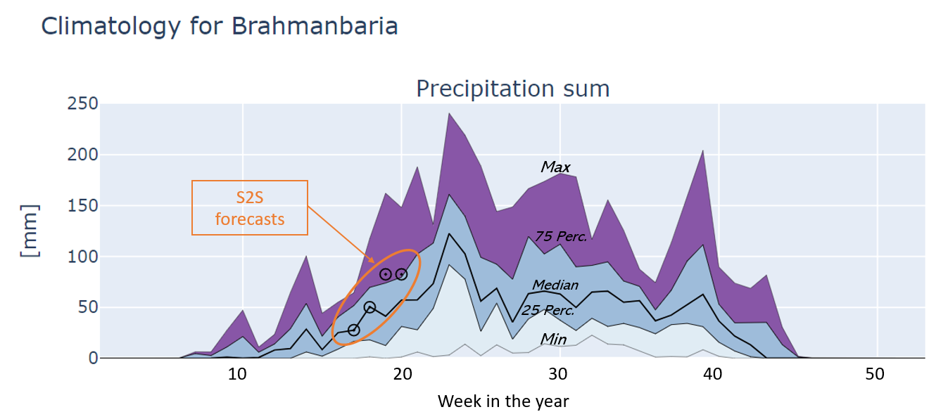
Precipitation: this shows the climatology of the weekly precipitation sum plus the current S2S forecast for precipitation plotted as circles.
Mean maximum temperature: this shows the climatology of the weekly mean maximum temperature plus the current S2S forecast for maximum temperature plotted as circles.
Mean minimum temperature: this shows the climatology of the weekly mean minimum temperature plus the current S2S forecast for minimum temperature plotted as circles.
The interpretation of the climatology is as follows: On the X axis the week number is shown which goes from 1 (first week of January) to 53 (last week of December). The Y axis shows the values for three different variables in mm or degrees Celsius. The thick line in the centre of the chart represents the median value. The lines above and below the median represent the 25th and 75th percentiles. The areas from P25 to the median and from the median to P75 have the same color and represent 50% of the data points in the climatology. The lower and upper lines represent the minimum and maximum of the distributions and the areas in between are filled with different colours to indicate that values in this range are more extreme.
The current S2S forecast (details are given under Forecast metadata) are added to the climatology as circles. By comparing the current forecast against the climatology it is immediately clear how that forecast relates to the climatology: is the average, extremely high or low. Moreover, the interpretation can be made for the coming four weeks as well.
See also the example below.
By default, the figures are provided as Scaleable Vector Graphics (SVG) which are compact, fast, scale well within a web browser and do not require an internet connection.
Alternatively, each figure is available as an an interactive HTML element that you can open with the link provide above each figure (hold the CTRL key for opening in a new window). HTML figures can be zoomed and rescaled in order to optimize the axis ranges, you can zoom into certain parts of the chart and there are hover labels available (move your mouse pointer over the circles) which give more information over the S2S forecast values. Moreover, HTML figures can be exported to other data formats. Displaying HTML figures is relatively slow therefore they are not used by default.
Background and financing
Jointly prepared by Bangladesh Meteorological Department (BMD), Bangladesh Department of Agricultural Extension (DAE), Weather Impact-Netherlands, Wageningen Environmental Research and Digital Innovation for Impact (Dii-Dhaka) under BWCSRP (Component-C), supported by the World Bank.
Contact info
For questions contact dr. Allard de Wit (allard.dewit@wur.nl), Wageningen Environmental Research.